

由于CSS3动画对低版本的浏览器的支持效果并不是很好,特别是IE9及以下版本,更是无法支持。 所以有时候一些简单的动画效果,还只是用js代码来实现,但是效率偏低,而且效果有些偏生硬,不够顺滑。 毕竟用js代码来实现动画并非正确之道。
虽说css实现动画效果看起来更顺滑一些,但是也只是相对而言,因为css3动画的也是一帧一帧的执行,由于多种因素的影响,细看之下也未必是真的顺滑,所以只要把动画设计让眼睛感觉到是顺滑的就能达到完美的效果。
在css3中,我们可以通过@keyframes创建关键帧动画效果。我们需要将@keyframes绑定到选择器中,否则不会有效果出现。同时,我们还需定义动画时长和动画名称
语法(@keyframes):
@keyframes animationname {keyframes-selector {css-styles;}}
| 值 | 描述 |
| animationname | 必需,定义动画的名称 |
| keyframes-selector | 必需,动画运行过程中的百分比 |
在css3中,我们以百分比来规定改变发生的时间,或者通过关键词 "from" 和 "to",等价于 0% 和 100%。其中,0% 是动画的开始时间,100% 动画的结束时间。
百分比分可以分解成无限多个,分解的越多,轨迹越复杂,达到的效果越好,这个需要在设计的时候细细琢磨
@keyframes myfirst
{
from {background: red;}
to {background: yellow;}
}

@-moz-keyframes myfirst /* Firefox */
{
from {background: red;}
to {background: yellow;}
}

@-webkit-keyframes myfirst /* Safari 和 Chrome */
{
from {background: red;}
to {background: yellow;}
}

@-o-keyframes myfirst /* Opera */
{
from {background: red;}
to {background: yellow;}
}

//或者用(%) 来指定运行过程中的行为
@keyframes myfirst
{
0%   {background: red;}
25%  {background: yellow;}
50%  {background: blue;}
100% {background: green;}
}

@-moz-keyframes myfirst /* Firefox */
{
0%   {background: red;}
25%  {background: yellow;}
50%  {background: blue;}
100% {background: green;}
}

@-webkit-keyframes myfirst /* Safari 和 Chrome */
{
0%   {background: red;}
25%  {background: yellow;}
50%  {background: blue;}
100% {background: green;}
}

@-o-keyframes myfirst /* Opera */
{
0%   {background: red;}
25%  {background: yellow;}
50%  {background: blue;}
100% {background: green;}
}
语法(animation)
animation 属性是一个简写属性,用于设置动画的属性:
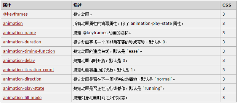
根据以上各种属性来设置动画在运行过程的各种状态来达到想要的效果。
代码示例:
运行名为 myfirst 的动画,其中设置了所有动画属性:
div
{
animation-name: myfirst;
animation-duration: 5s;
animation-timing-function: linear;
animation-delay: 2s;
animation-iteration-count: infinite;
animation-direction: alternate;
animation-play-state: running;
/* Firefox: */
-moz-animation-name: myfirst;
-moz-animation-duration: 5s;
-moz-animation-timing-function: linear;
-moz-animation-delay: 2s;
-moz-animation-iteration-count: infinite;
-moz-animation-direction: alternate;
-moz-animation-play-state: running;
/* Safari 和 Chrome: */
-webkit-animation-name: myfirst;
-webkit-animation-duration: 5s;
-webkit-animation-timing-function: linear;
-webkit-animation-delay: 2s;
-webkit-animation-iteration-count: infinite;
-webkit-animation-direction: alternate;
-webkit-animation-play-state: running;
/* Opera: */
-o-animation-name: myfirst;
-o-animation-duration: 5s;
-o-animation-timing-function: linear;
-o-animation-delay: 2s;
-o-animation-iteration-count: infinite;
-o-animation-direction: alternate;
-o-animation-play-state: running;
}

与上面的动画相同,但是使用了简写的动画 animation 属性:(二者用其一即可)
div
{
animation: myfirst 5s linear 2s infinite alternate;
/* Firefox: */
-moz-animation: myfirst 5s linear 2s infinite alternate;
/* Safari 和 Chrome: */
-webkit-animation: myfirst 5s linear 2s infinite alternate;
/* Opera: */
-o-animation: myfirst 5s linear 2s infinite alternate;
}
动画效果虽然创建出来了,但是还需要配合js代码才能在合适的时机执行动画效果
调用动画的方式有两种:
//方式一,给元素style的WebkitAnimation 、animation 添加行为
var x = document.getElementById("myDIV");
// 使用 JavaScript 开始动画
function myFunction() {
    x.style.WebkitAnimation = "myfirst 5s linear 2s infinite alternate";
  // Chrome, Safari 和 Opera 代码
  x.style.animation = "myfirst 5s linear 2s infinite alternate";
}

//方式二, 给元素添加上包含动画的类名(class) ,在动画结束是remove掉。
 //为动画监听结束事件 *** 这里有一个比较严重的问题, 在我们用的时候, 有可能会多次执行下边的代码,就是为  //元素重复绑定监听事件,会导致动画出现卡顿现象,一定要避免

if(x){
    x.addEventListener("webkitAnimationEnd", function(){ //动画结束时事件
         eListenerEnd(bgflag,bgflag2);
    }, false);
    x.addEventListener("animationend", function(){ //动画结束时事件
         eListenerEnd(bgflag,bgflag2);
    }, false);
}
兼容性问题一
动画执行的很漂亮,但是在Safari中表现的极为差劲, 在苹果的系统上9.0版本以上的Safari表现正常,但是8.0及以下的版本,动画连动都不动,样式错乱,各种猜测,方法各种试,各种搜索,都不尽如人意,实在头大,最后不得不用排除法找到问题的所在
代码如斯:
.slide-mask2{
    animation-name: myfirst;
    animation-duration: 0.65s;
    animation-timing-function: linear;
    animation-delay: 0s;
    animation-iteration-count: 1;
    animation-direction: normal;
    animation-play-state: running;
    animation-fill-mode: forwards;
}
@keyframes myfirst
{
    0%   {left:0px; top:0%;height: 0%;}
    40%  {left:0px; top:-15%; height: 85%;}
    60%  {left:0px; top:20%; height: 70%;}
    100% {left:0px; top:100%; height: 0%;}
}
@-moz-keyframes myfirst /* Firefox */
{
    0%   {left:0px; top:0%;height: 0%;}
    40%  {left:0px; top:-15%; height: 85%;}
    60%  {left:0px; top:20%; height: 70%;}
    100% {left:0px; top:100%; height: 0%;}
}

@-webkit-keyframes myfirst /* Safari 和 Chrome */
{
    0%   {left:0px; top:0%;height: 0%;}
    40%  {left:0px; top:-15%; height: 85%;}
    60%  {left:0px; top:20%; height: 70%;}
    100% {left:0px; top:100%; height: 0%;}
}

@-o-keyframes myfirst /* Opera */
{
    0%   {left:0px; top:0%;height: 0%;}
    40%  {left:0px; top:-15%; height: 85%;}
    60%  {left:0px; top:20%; height: 70%;}
    100% {left:0px; top:100%; height: 0%;}
}
修改如斯:
.slide-mask2{
    animation: myfirst 0.65s linear 0s 1 normal forwards;
    -moz-animation: myfirst 0.65s linear 0s 1 normal forwards;    /* Firefox */
    -webkit-animation: myfirst 0.65s linear 0s 1 normal forwards;    /* Safari 和 Chrome */
    -o-animation: myfirst 0.65s linear 0s 1 normal forwards;    /* Opera */
}
@keyframes myfirst
{
    0%   {left:0px; top:0%;height: 0%;}
    40%  {left:0px; top:-15%; height: 85%;}
    60%  {left:0px; top:20%; height: 70%;}
    100% {left:0px; top:100%; height: 0%;}
}
@-moz-keyframes myfirst /* Firefox */
{
    0%   {left:0px; top:0%;height: 0%;}
    40%  {left:0px; top:-15%; height: 85%;}
    60%  {left:0px; top:20%; height: 70%;}
    100% {left:0px; top:100%; height: 0%;}
}

@-webkit-keyframes myfirst /* Safari 和 Chrome */
{
    0%   {left:0px; top:0%;height: 0%;}
    40%  {left:0px; top:-15%; height: 85%;}
    60%  {left:0px; top:20%; height: 70%;}
    100% {left:0px; top:100%; height: 0%;}
}

@-o-keyframes myfirst /* Opera */
{
    0%   {left:0px; top:0%;height: 0%;}
    40%  {left:0px; top:-15%; height: 85%;}
    60%  {left:0px; top:20%; height: 70%;}
    100% {left:0px; top:100%; height: 0%;}
}
原因总结: 样式中的行为,要包含兼容各种浏览器的行为, keyframes中也要设置兼容浏览器的行为, 最后, 8.0及以下版本的Safari不支持 animation-play-state: running; 具体原因我不能描述清楚,至此,此兼容性问题解决。
ps: 虽然动画执行了,但是在windows系统下的Safari浏览器中,动画执行的效果出现卡顿现象, 在ios系统下则很顺畅,所以我以为这是windows系统下Safari浏览器的问题,所以并不再继续做处理。
js如何动态生成动画的样式呢?参考文章:js 动态添加、修改css3 @keyframes
参考链接: W3School之css动画教程